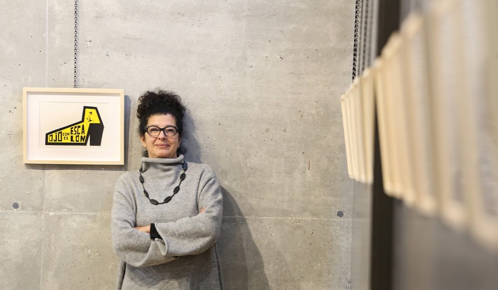
LZF has a unique ability to connect with an audience, by promoting its lighting products and ideas in a manner that is both engaging and novel. At LZF, communication and graphic design are never an afterthought: these elements are woven into the brand’s narrative, helping to tell the story of its original handmade wood veneer lamps. LZF co-founder Mariví Calvo has developed and directed every piece of imaginative communication. An artist and a designer, Mariví’s keen intellect, meticulous eye, creative approach and expert curation, work to ensure LZF is celebrated as much for its graphic communication prowess as for its lighting genius.
Here, Mariví provides an insight to LZF’s approach to communication and graphic design.
Q: How important is graphic design as a tool for communicating LZF’s values?
Mariví: At LZF, our goal is to apply design in all possible ways: from the products we develop to how we show them at fairs to the communication campaigns that revolve around our lamps. In essence, we understand the absolute importance of graphic design and communication design when seeking to convey LZF’s values. Design is part of a shared experience, a common sensibility, a cause—it is the main reason behind the processes and working mechanisms of LZF, from production to communication.
Q: You worked with PalauGea, a Valencia-based communication consultancy, to renew LZF’s logo as the company approaches its 25th anniversary. Why was this necessary?
Mariví: The updates to the LZF logo were highly recommended and as we approach our 25th anniversary, the time was right. We had a logo that we liked a lot, but we knew it could be made better; we could improve its impact potential.

The old LZF logos.

LZF’s new logo, created in collaboration with PalauGea.
Our branding has evolved from the original concept formed in 1994, from a logo using a cheeky little devil, to using inverted commas as ‘horns’. It was a way of claiming our origins and keeping them in the new version of our logo.
Q: We live in a digital age, one in which social media is pervasive. How do you communicate the very essence of LZF’s work—its handmade wood veneer lights—to a digital audience?
Mariví: The ‘short video’ is a tool that allows us to create dynamic experiences around the life of a product—it is very much our favourite tool.
Communicating the essence of a lamp requires a thorough understanding of both the product and the project. It is important to synthesise the concepts to be transmitted, in order to make the customer fall in love. We must visualise the needs of the market and have a clear focus, so that we achieve an original, sensible and truthful piece of communication.
The following concepts help to guide us and explain just what our handmade videos are about:
For LZF, ‘handmade’ means creation. From its origin, a lamp is a natural product, one that is distinctive and chosen for its flair and unique beauty.
Each sheet of wood is manipulated by hand until its final modelling. A lamp is made by people and for people—person to person.
There is a transformative aspect, where a lamp is turned on and adapted by adjusting the appropriate light temperature for every veneer colour and in each environment.
Q: If we take the example of one particular LZF communication campaign, ‘Telling Tales’ (for which the company was awarded a prestigious Red Dot Award in Communication Design), how did you dream up and accomplish such an ambitious project?
Mariví: I often dream that we can work and enjoy what we do. We can help LZF to grow by learning along with those who are involved and who immerse themselves with us in that dream. And sometimes, we achieve a surprising, original and well executed piece of work, something we can use in the course of a year and across many more.
‘Telling Tales’ was one of those cases. It began in 2014 when we found ourselves repeating the tedium of a typical photo session, where nothing of substance happens and where scenarios are so common to every brand—they are diluted and depersonalised.

Created in collaboration with Valencia-based Masquespacio Studio, ‘Telling Tales’ was a vividly coloured, sumptuous and seductive communication campaign. LZF’s Carambola lamp, designed by Oskar Cerezo, is pictured.
My idea was to assemble a team capable of creating a series of short stories in order to present the new products. It was absolutely essential that we furnish the products with a story to tell and so we worked with the extremely creative Spanish writer Carlos Grassa Toro.
The stories were set in the 1950s, and the atmosphere and colours were inspired by the realist paintings of American artist Edward Hopper. There was a nod to the prevailing objects of that period, referencing famous industrial designs. For example, a retro-like Marshall amplifier that appears with the Air table lamp or Eero Saarinen’s Womb chair that appears alongside the Cervantes lamp.

The Cervantes lamp, designed by Burkhard Dämmer, in the ‘Telling Tales’ campaign. Eero Saarinen’s Womb chair appears in this beautiful mid-century style image.
The characters were in charge of carrying the burden of the story and the lamps were witness to their most intimate moments, those things that happen on the inside. The leading character was always a woman. It was important that any natural light remained soft, ideally when the sun was low, and that the lamps were the unmistakable protagonists illuminating every scene.
And so ‘Telling Tales’ came to be, and we developed a delicious friendship with Carlos Grassa, having many meetings into the evening and defining every detail with the team. Everyone involved cared for and wanted the project.
Q: Graphic design is very much an art form and you are an artist. What qualities do you believe a person needs to successfully communicate through graphic design?
Mariví: A good graphic designer must know how to transmit the fundamental values of the company they work for and then go further, improving the message and language. They should be able to enrich their interpretation of the company with original images and styles, designed to revitalise and strengthen the philosophy on which the company is based. The graphic designer’s job is to make the client smarter and to record their own style.


