In the second of two articles on colour, we explore its use in interior schemes and lighting.
Across the many disciplines of design, colour is a powerful tool of the trade. Colour can make or break an interior scheme, its application affected by a range of factors, including: colour combinations, colour perception (how we see and experience colour), light and material surfaces.
As a starting point for any interior scheme, it can be helpful to refer to the relationship between colours as they sit on a colour wheel. For example, an analogous scheme will use two or more adjacent colours (such as green and yellow), whereas a complementary scheme will employ opposite colours (such as blue and orange). Neutrals—typically black, white and grey, but also earthy tones—do not appear on the colour wheel. Neutral colours are often straightforward and easy to use. When working with a monochromatic neutral scheme, the trick is to add variety through texture and material, and to introduce accent colours: a pop of red in an otherwise grey interior will inject an element of drama.
Mood, memory, sense of place, comfort, warmth and outlook, are influenced by the way in which colours are combined. Dimensions are impacted by colour: warm colours (reds and yellows) and darker tones will make a space feel smaller; by contrast, cold colours (blues and greens) and lighter tones will make a space feel larger. Colours can conjure up images of particular scenes and settings: a combination of exuberant and rich earthy hues, blues, reds and yellows, might evoke the notion of a vivid Moorish scene; a palette of greys, whites and one or two quiet accent colours, might call to mind a restrained, unruffled Nordic setting.
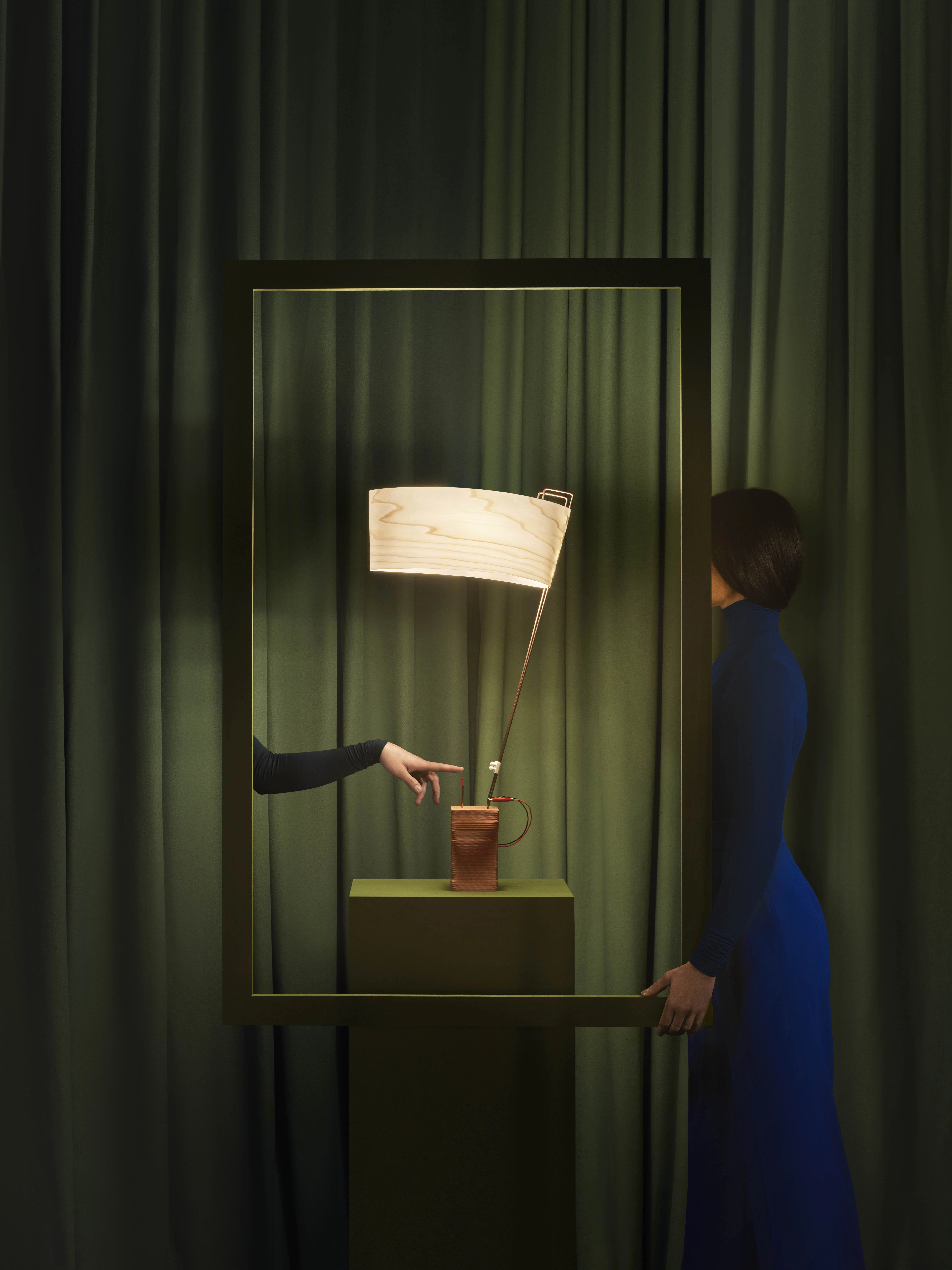
Light and colour are intrinsically linked: colour will have a bearing on the temperature of light and its luminous quality. Light’s temperature ranges from warm to cold, and the appearance of a lamp with a warmer bulb will differ to that with a colder bulb (in terms of utility, the warmer bulb is ideal for ambience, the colder bulb for concentration). A further factor in the relationship between light and colour is the material surface. The striking manner in which light passes through wood veneer is a hallmark of LZF. To achieve this effect, LZF treats every natural timber veneer with Timberlite®. A patented process, Timberlite® causes the veneer to become exceptionally pliable and impervious to breakage. Importantly, it ensures that LZF’s lamps look incredible and offer differing perspectives, when switched on or off. Moreover, LZF’s assortment of coloured timber veneers—ivory white, yellow, orange, red, blue, grey, turquoise, chocolate and pink—provides designers with a range of colourful choices when working on interior schemes.
In summary, while there are general rules and principles when using colour in design and lighting, we all experience colour in varying ways. Ergo, it will pay dividends to experiment with colour combinations and schemes, in order to achieve the desired effect.

Written by Gerard McGuickin


