The new LZF catalogue describes a love affair with wood and light, creativity and design, craftsmanship and innovation. Designed by Barcelona-based Lo Siento Studio, the catalogue provides a comprehensive overview of LZF’s complete oeuvre, including the remarkable new collection (with more than twenty-five lighting fixtures), LZF’s classic lamps and the ever enthralling life-size collection.
In 2020, LZF will celebrate twenty-five years in the business. With the new catalogue, it is hoped that people will take some visual pleasure in LZF’s lamps (new and classic)—they are, after all, a physical expression of everything that LZF stands for, from efficiency to sustainability, and innovation to longevity.
Getting behind the design of the new catalogue, we talked to Borja Martínez (BM), Creative Director and Founder at Lo Siento Studio.

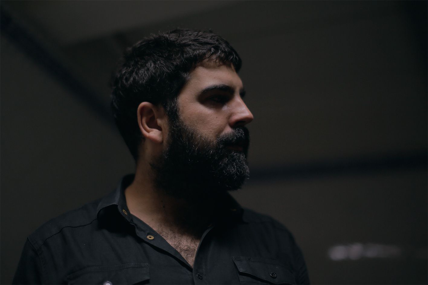
Borja Martínez. Photo by Rodrigo Diaz Wichmann.
What’s the story behind the design of the new LZF catalogue?
(BM) It is a direct tribute to LZF’s main material: wood. Wood is the common thread we use to visually narrate the catalogue. For this, we made several physical pieces in wood using typography as the main vehicle (for example, on the cover image you see ‘wood touched by light’). The typography is the graphic narrator of the catalogue, adding a sense of dynamism. In essence, the idea was to infuse graphic wood throughout the publication.
What is your relationship with LZF—how was it working with the brand on this particular project?
(BM) The process was very satisfactory throughout. Our collaboration with LZF has been a fluid one, and the brand contributed its vision to a number of areas related to the catalogue’s design. LZF completely understood the overall concept that we were proposing, including the graphic elements, and thus we were able to achieve a great final result.
What, in your opinion, is particularly unique about LZF?
(BM) The clever use of wood, a warm and organic material, makes LZF unique in the lighting sector. LZF treats wood with a real mastery and sensitivity, expressing creativity through a range of straight and wavy shapes. The way in which light reflects on an LZF lampshade creates a very special sense of warmth, and highlights the brand’s unmistakable trademark style.
In today’s ultra-digital world, what is the significance of a physical, paper catalogue?
(BM) I think it’s quite important to maintain the craft process that exists behind the manufacture of a paper catalogue—it will never be the same as a digitised version. The senses connect much more with a physical, warm and tangible paper catalogue than with a digital one. A digitised catalogue is still a version and not an original piece.
Lo Siento’s mantra is ‘crafted graphic design’. Can you say more about this?
(BM) We try to put a handmade stamp on everything we do. When we work, we strive to minimise the use of filters and digital manipulation, in order to preserve the authentic spirit of a piece of work. Our approach is constantly connected with manual processes and elaborating on objects—together with typography, this helps us solve graphic problems.
Spanning more than 250 pages, the new LZF catalogue was four months in the making. A veritable labour of love, it is, in many ways, a document of everything the brand has achieved to date. You can find digital and pdf versions of the new catalogue here, and if you’d like a physical copy, drop LZF an email: [email protected].
Check out some examples of work by Lo Siento Studio
‘The symbiosis between typography and physical material is a constant in our way of processing projects.’—Borja Martínez in an interview with TypeParis.


